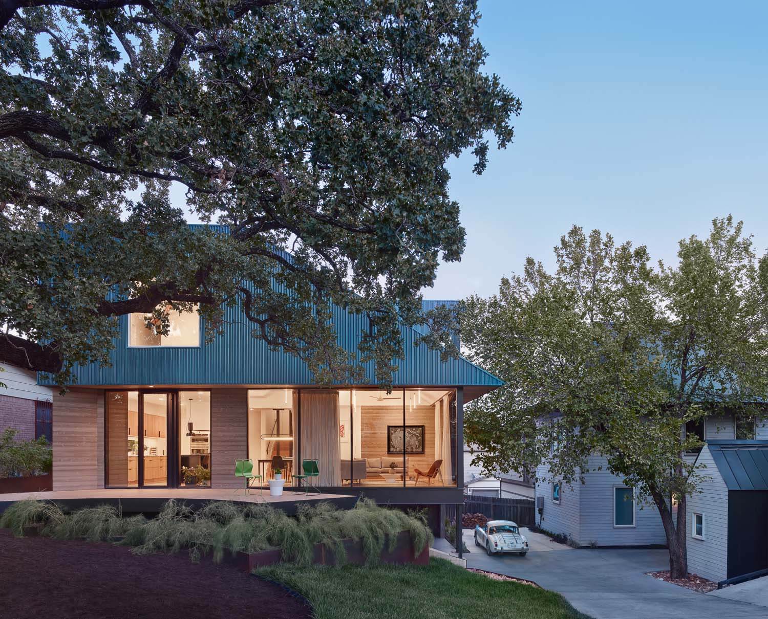
Quietly set back behind a sprawling heritage oak lies the Walnut Residence, a taut three-bedroom home designed and built by Minguell-McQuary in Austin.
The Walnut Residence is one of three homes on a large corner lot on bustling 12th street, a critical corridor connecting the east side’s historic and rapidly developing neighborhoods with the city’s downtown core. Each home was designed by Minguell-McQuary, but the Walnut design is the standout. The architects thoughtfully composed the site to step down along a dramatic grade change that, when combined with heritage trees, necessitated a nuanced approach to developing the site. Resisting the standard “cottage court” approach, defined by a central hardscaped driveway, this parcel gives that central space to a landscaped courtyard.
The homes themselves are somewhat muted. Harmonious in their material treatment and simplicity of form, yet each a distinct composition, there is a humility on display. The buildings are special, but their extravagances are subtle, neither ostentatious nor overindulgent. There is a reassuring sense that things are as they should be.

Architects José Minguell and Laura McQuary, the husband-and-wife duo who authored the site, designed their practice around making thoughtful, high-end homes accessible to more people without concessions.
“We were doing really expensive houses, and it was just unsatisfying knowing that we could never actually afford a house that we designed,” Minguell explained, adding, “We want to make nice things for people like us—real houses.”
Accomplishing that kind of market accessibility while avoiding the race-to-the-bottom that defines much of the city’s developer-driven housing projects, was no small feat. However, since the architects also served as the developer and general contractor in addition to their design roles, they had complete control over prioritizing where and how the budget flowed.
“Our details are materials that you would see in any other house, but done a little differently. We try to keep it simple, and we stay away from techniques that require specialty expertise from our subcontractors,” explained Minguell, “It’s just about management and a little bit of tweaking the typical approach.”

Approaching toward the home from the street, guests pass through an abstract wood and steel gate, a symbolic threshold in the absence of any fences on the property. To the left, a tapering gravel path arcs around a heritage oak’s sturdy trunk, leading to a wooden deck that follows the same trajectory. Here, the first level’s floor-to-ceiling windows are set back below a light blue, wedge-shaped second story, partially obscured from the street by foliage.
Here, the home’s organizing strategy reveals itself: by stepping back from the oak tree while stepping into the sloping earth, the structure retains the ground at the site’s highest elevation, allowing for gentler access into the neighboring two homes. In effect, the home is nested into the grade change, yet partially perched at its southern elevation as the landscape drapes away from the gradually exposed volume.
Inside, the home balances a tidy and rational layout with moments of exception, elevated by standard materials deployed in innovative ways. Off-the-shelf products are incorporated with higher-end, custom detailing, all in service to comfortable and well-proportioned spaces at an affordable cost.

“We liked the idea of an open plan, but we don’t like the idea of a blank warehouse space. So, there’s a series of articulations. The dining and living rooms have a vaulted ceiling, the kitchen has its own defined ceiling plane, and there are volumes from above that play together to define the spaces,” said Minguell. “It’s spiritual, in a way.”

The home is especially successful in its interplay with the landscape itself, without necessarily seeking to be perceived as a wholly natural or seamless part of it.
In this way, the home rejects a kind of pedagogy in favor of the more direct approach, a microcosm of the guiding principles imbued within the architects’ considerate work. It represents a fresh approach to home building in the U.S. where we urgently need considered, yet realistic options for overcoming the housing crisis.
Christopher Ferguson is an architect, photographer, and writer who has lived and worked in Austin since 2008.

