- Architect:
- Graphite Design Group
- Location:
- Bellevue, Washington
- Completion Date:
- 2024
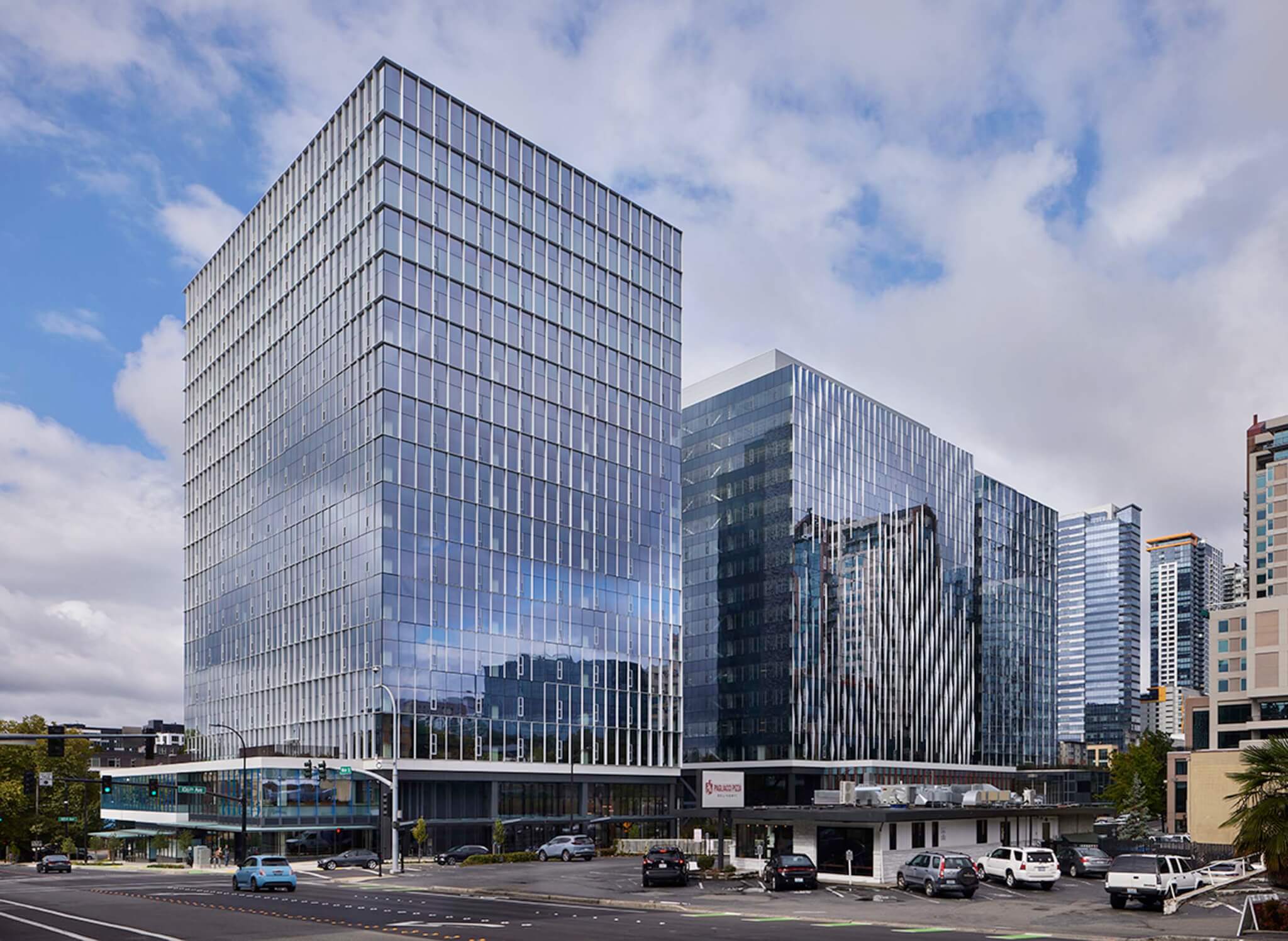
Graphite Design Group has added three new office towers to downtown Bellevue, Washington, a satellite city of Seattle. Faced with a glass curtain wall, the three buildings were distinguished from one another through the use of unique mullion patterns. The development, known as West Main, contributes to the city’s already-booming business and tech presence.

The decision to build three towers on the site was driven by zoning regulations. Each of the towers maximizes the allowable height, with two reaching 16 stories and one climbing to 17.
“We contemplated different ways to distinguish the towers from one another, while also acknowledging that any project gains some value through a collection of buildings…We didn’t want them to be identical twins, but more like brothers or cousins,” said Peter Kresch, principal at Graphite Design Group.
To do this, the architects devised three unique facade expressions.

The first tower was designed with a gridded mullion system that modulates in depth across the face of the building. To achieve this effect 10 different panel types were used each with a different fin depth. The architects refer to this pattern as “push-pull.”

On the second tower, the architects developed a “weave” pattern consisting of curved aluminum fins that project from the building.

Finally, for the third pattern, cruciform-shaped mullions were specified. These forms project the furthest at the center of the cross shape and gradually taper down in depth along each arm.
These expressive patterns are found on the outward, city-facing elevations of the three buildings. The elevations that face into the development lack pronounced mullions or shading devices.

Additionally, West Main’s curtain wall facade is designed to reference Meydenbauer Creek, a defunct stream that once ran through the site. On certain elevations, the aluminum mullions recede, revealing sinuous segment of unshaded curtain wall emulating the contours of a stream.

Large portions of the buildings’ inward-facing elevations are occupied by offset elevator cores, which were utilized to maximize leasable floor area on the interior of the buildings.
“In addition to height restrictions on the property, there were also floor-size restrictions,” added Kresch. “Within the allowable floor size—which is relatively small—we found the buildings to be more efficient with the core pulled to the side.”
To decorate these large, opaque elevator cores, Graphite Design Group designed a mosaic wall which covers the surface area.
In total, over 60,000 individual tiles were used to decorate the three elevator cores. To further distinguish the buildings, a unique color palette was devised for each structure. Because there were so many tiles, the architects could not specify the exact placement of individual tiles, but rather developed a general installation sequence that maintained a cohesive pattern.

West Main’s ground floor podiums are all color coded to improve way finding. The colored portions of the glass were achieved with a digital print. Up close, the print consists of a 2D pattern, matching the design of the curtain wall on the tower above.
As a process, digital printing has advantages over the use of a ceramic frit, argues Kresch.
“[A ceramic frit] can only be unique within each five or six foot panel of glass,” he said. “A digital print opens a lot more possibilities… Unlike a frit, the pattern can be fully custom and unique from one panel to another because each panel of glass is printed independently.”

To meet the state of Washington’s strict energy code, the project was required to use high-performance glazing equipped with a low-e coating. Additionally, an offset elevator core and opaque spandrel glass allowed the architects to reduce the project’s overall glazing ratio to below 40 percent.
West Main is currently pursuing LEED Gold–certification.

